
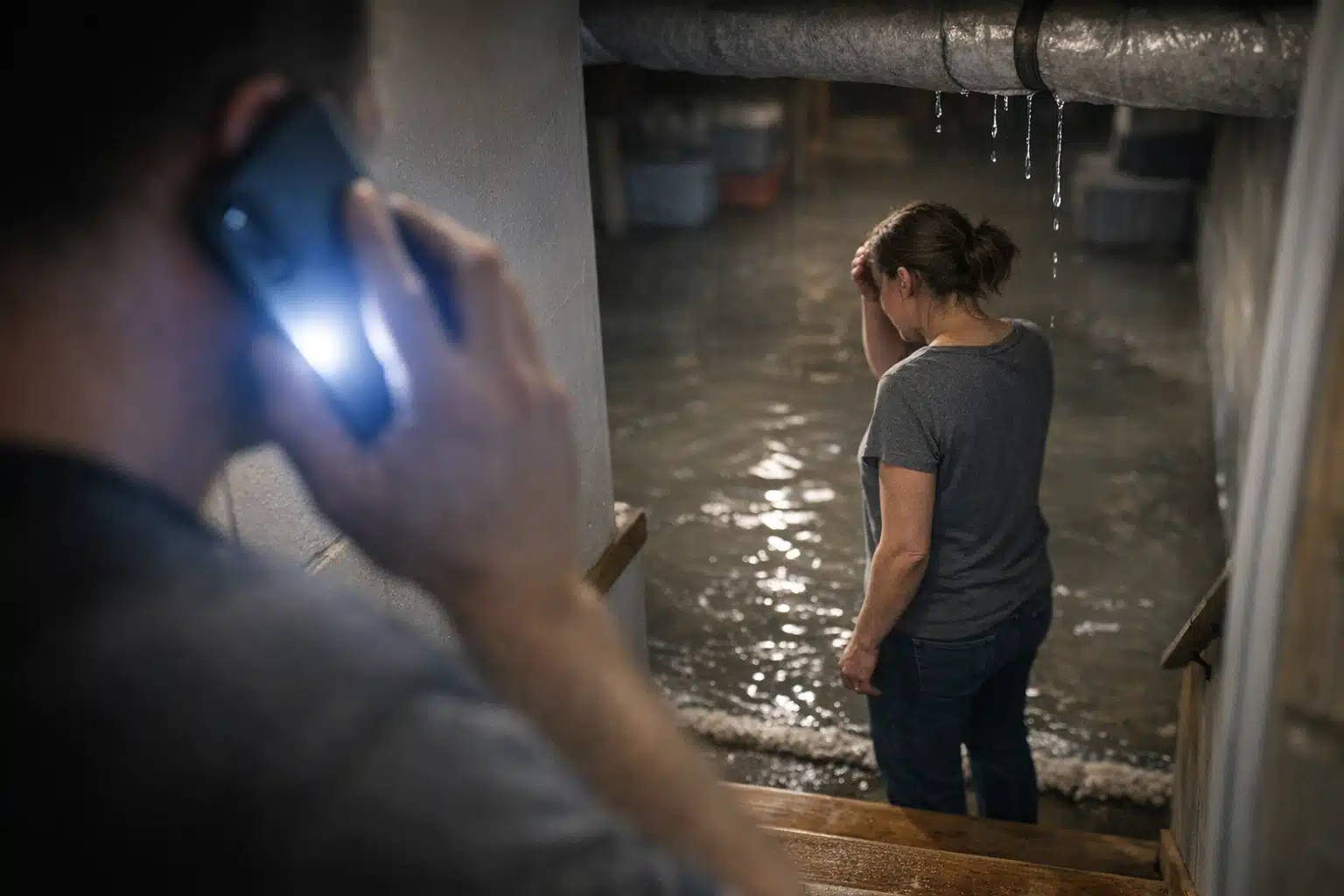
A homeowner standing in two inches of basement water does not read your “About Us” page. They want a phone number, and they want it in under five seconds. Your restoration website conversion structure either respects that panic or loses the call to the next company in the search results.
Most restoration sites are built like brochures. They pile on nine pages, three drop-down menus, and a slider nobody watches. For emergency visitors, that clutter kills conversions.
This post breaks down the two-page rule: the only two pages that matter during a water, fire, or mold emergency. You will learn what to keep, what to cut, and where to relocate everything else.
Why Restoration Website Conversion Structure Is Different From Home Services
A kitchen remodeler sells a considered purchase. Buyers compare portfolios for weeks, read reviews, and request three quotes. Restoration buyers behave nothing like that.
Restoration visitors arrive mid-crisis. Their carpet is soaked, their ceiling is dripping, or smoke still hangs in the air. Their decision window is minutes, not weeks.
The rule: fewer clicks between the visitor and a ringing phone equals more booked jobs. Every extra page or menu item adds friction at the worst moment.
The Cost of a Cluttered Site During a Storm Spike
When a hailstorm hits a metro area, search volume for “water damage near me” jumps within the hour. Ad clicks get expensive fast, sometimes to per click for water mitigation terms.
Paying that much to send a panicked visitor to a homepage with seven menu items wastes money. If your click-to-call rate drops from 30% to 12%, you just doubled your cost per lead overnight.
The Two-Page Rule Explained
The two-page rule means an emergency visitor needs only two pages to convert: a service-specific emergency page and a direct contact path. Everything else is secondary.

These are the two pages that carry the weight:
- The Emergency Service Page — one page per major service (water, fire, mold), each built to trigger a call.
- The Contact / Call Confirmation Page — a low-friction backup for visitors who scroll or hesitate.
Everything else on your site supports trust and SEO. It should never sit between a scared homeowner and your phone number.
Page One: The Emergency Service Landing Page Structure
The emergency service landing page structure follows one job: get the call in the first screen. No scrolling required to find your number.
Build each emergency page in this order from top to bottom:
- Phone number as a tap-to-call button, above the fold. Sticky on mobile so it follows the scroll.
- One headline naming the problem and the response time. Example: “Water Damage Cleanup in Denver — Crews On-Site in 60 Minutes.”
- Three trust signals in a single row. 24/7 availability, insurance billing, licensed technicians.
- A short “what happens next” list. Three steps: you call, we arrive, we extract and dry.
- A second tap-to-call button after the steps. Repeat the offer for scrollers.
Keep the whole page under 400 words. An emergency visitor scans; they do not read paragraphs about your company history.
Page Two: The Contact Path That Backs Up the Call
Some visitors will not call a number they see. They want to submit a form or text instead, especially younger homeowners.
Your second page handles them with a form of three fields only: name, phone, and address. Add a text option using your same line, 720‑885‑0749, since texting feels lower-pressure to hesitant visitors.
Every form submission should trigger an instant text alert to your team. Response speed under five minutes is the single biggest lever on lead-to-job rates.
What to Cut and What to Relocate
Simplifying does not mean deleting your content. It means moving low-priority pages out of the emergency pathway.
Here is where common pages belong:
- About Us — keep it, but move it to the footer. It builds trust for slow-season researchers, not crisis callers.
- Photo galleries — relocate to the bottom of each service page as a small proof strip, not a separate menu item.
- Blog and resource articles — valuable for SEO, but link them from the footer only.
- Multi-step estimate forms — cut entirely from emergency pages. Long forms belong on non-urgent pages like reconstruction quotes.
- Service area lists — fold city names into your emergency page copy for local SEO instead of a standalone page maze.
The top navigation should hold three items max: Emergency Services, Reviews, and a phone number. Cut the rest from the header.
Handling Reputation Recovery Without Adding Clutter
A restoration company rebuilding after a few bad reviews needs proof, not a wall of testimonials. Place three recent five-star reviews directly on the emergency page.
Pull them from Google so the source is verifiable. One line of star rating plus a real first name beats a dedicated testimonials page nobody visits during a flood.
How the Two-Page Rule Supports Seasonal Campaigns
Restoration demand swings hard by season. Frozen-pipe calls spike in January; mold and roof-leak calls climb after spring storms.
A lean site lets you spin up campaign traffic without rebuilding pages each season. Point your Google Ads for “frozen pipe repair” straight to your water emergency page, no homepage detour.
Match the ad headline to the landing page headline word-for-word. This message match lifts Quality Score, which lowers your cost per click during expensive storm surges.
Tracking Which Page Earns the Call
You cannot fix what you cannot measure. Assign a tracking number to each emergency page and each ad campaign.
Follow these steps to track lead source cleanly:
- Use a dedicated call-tracking number per traffic source: organic, Google Ads, and Local Services Ads.
- Tag form submissions with a hidden field for the landing page URL.
- Review call recordings weekly to catch missed calls during peak hours.
- Compare cost per booked job, not cost per lead, across sources.
A missed call during a storm spike is a job handed to a competitor. Staffing your phone matters as much as your page design.
A Real Before-and-After Scenario
A mitigation company ran a nine-page site with a dropdown menu and a contact form buried on page four. Their mobile click-to-call rate sat near 10%.
They rebuilt around three emergency pages, each with a sticky call button and a three-field form. They moved the blog, gallery, and About page to the footer.
Within one storm season, mobile calls climbed and cost per lead on paid traffic fell. The change was structural, not a bigger ad budget.
Conclusion
Restoration marketing rewards speed and clarity over volume. A tight restoration website conversion structure, built around one emergency page and one contact path, turns panicked visitors into phone calls before they bounce to a competitor.
Cut the clutter from your header, relocate trust pages to the footer, and put a tap-to-call button in front of every visitor. The Restoration Marketers builds emergency-first sites that convert during storm spikes and slow seasons alike.
Call or text The Restoration Marketers at 720‑885‑0749 to rebuild your site around the two pages that book jobs, or visit https://restorationmarketers.com.